What are Engagement Ratings and how are they calculated - Student Guide
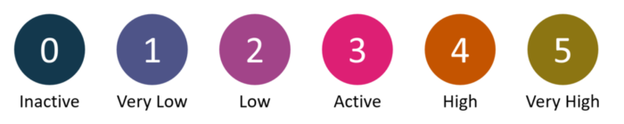
StREAM@Leeds collects and analyses data on your usage of key digital education systems such as Minerva, the library, lecture capture, Teams, Zoom and others. It then calculates daily Engagement Ratings for you based on how much you've interacted with these digital education systems. These Engagement Ratings we use are:
- Inactive (0)
- Very Low (1)
- Low (2)
- Active (3)
- High (4)
- Very High (5)
How Engagement Ratings are calculated
While Engagement Ratings are calculated daily, they consider activity from the last 7 days for full-time students and from the last 21 days for part-time students. This ensures that they do not fluctuate dramatically each day. For a full-time student, this means that if you have engaged at a high level between Monday and Friday but stop engaging on the weekend, you won't suddenly drop into the Inactive (0) category if you re-engage on Monday.
As well as being a way to help you reflect on how you engage with digital resources during your studies, Engagement Ratings are used to help identify students who may benefit from support and guidance through a feature called Notifications. For example, if a full-time student has Inactive (0) Engagement Ratings for 7 consecutive days, Notifications are used to flag this. You will be able to see if you’ve triggered a Notification within StREAM@Leeds, which gives you the opportunity to introspect on your learning in the last 7 days. For part-time students, Notifications will trigger after 14 days instead of 7.
It's important to remember that StREAM@Leeds provides only a view of your interactions with specific resources and therefore they should not be used in isolation as an indicator of how well you are engaged with your studies. If you are interested in which digital education systems are used to calculate Engagement Ratings see, Which digital education systems and resources are used in StREAM@Leeds.
Where do these Engagement Ratings appear?
Your Engagement Ratings (and a summary of your activity within key digital education systems) are presented to you via your StREAM@Leeds Dashboard. Your Dashboard highlights your:
- Daily Engagement Rating - this takes into account your digital activity across the last 7* days (*7 days for full-time students and 21 days for part-time students).
- Average Engagement Rating
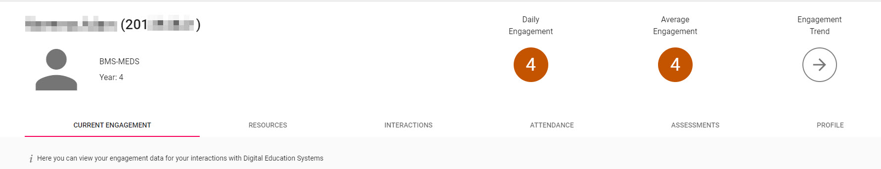
The CURRENT ENGAGEMENT tab on your StREAM@Leeds Dashboard summarises how you have been engaging with digital education systems and resources through various charts and graphs.
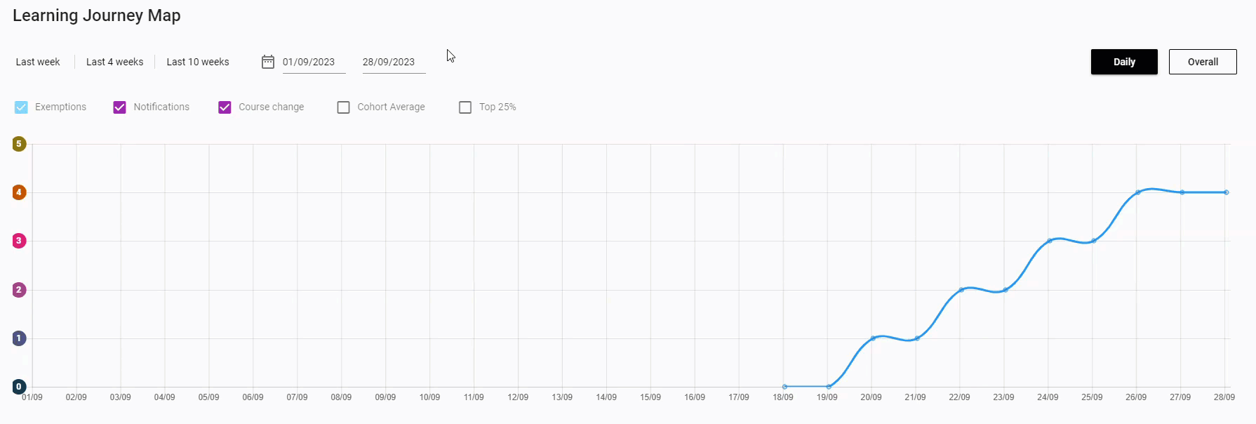
A key area to review within this tab is the Learning Journey Map graph.
By default it will show you information based on the last 4 weeks, you'll have the option to set a date range or use one of the date selectors to see the dates you are interested in (e.g. Last week).
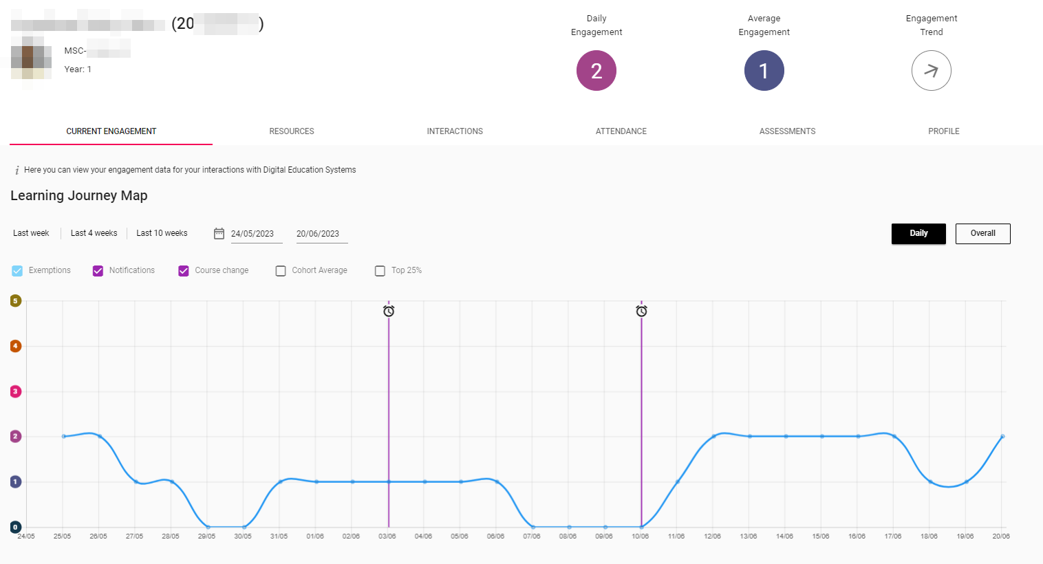
You'll see a few different things plotted on this graph:
You will see how your Engagement Ratings change over time (plotted as a solid blue line). By default you'll see the last four weeks of engagement. For example, 3rd October, Engagement Rating 3, 4th October, Engagement Rating 4 and so on.
![]() If you have no digital Engagement, or low digital Engagement Ratings for 7 consecutive days (14 days for part-time students) you will trigger a Notification within the system. This will be indicated by a purple clock icon against the date it was triggered. The system does not automatically email you if you trigger a Notification. It is registered in the system and SES staff who support digital engagement monitoring will be able to see that this has happened. They may then reach out to you to offer support and advice.
If you have no digital Engagement, or low digital Engagement Ratings for 7 consecutive days (14 days for part-time students) you will trigger a Notification within the system. This will be indicated by a purple clock icon against the date it was triggered. The system does not automatically email you if you trigger a Notification. It is registered in the system and SES staff who support digital engagement monitoring will be able to see that this has happened. They may then reach out to you to offer support and advice.
- Learn more by reading: What are Notifications?
How using the Cohort Average can help you to understand your digital engagement
Context is very important when looking at your data. If your Engagement Ratings are on the lower end, this does not always mean your level of interaction is a problem. We recommend checking your Cohort Average to get a sense of how you are engaging in comparison with peers on the same programme of study. Depending on the way your course is structured you may not have high Engagement Ratings each day.
The Cohort Average shows the average engagement of students studying the same programme as you. This can help you to understand where your engagement patterns differ from the rest of your cohort. You can view your Cohort Average by checking the Cohort Average option just above your Learning Journey Map. This will add a red, dotted line to the map to show your cohort's average alongside your engagement (which is indicated by the blue solid line).
In instances when your Engagement Ratings drop or aren't quite at the same level as your peers, you should consider whether this is a result of any external circumstances you have experienced.
Whilst the Cohort averages on the engagement line chart shown on your StREAM@Leeds dashboard are calculated using data from you and your course mates, this will only be an aggregate value, there will be no way for someone to identify your or any other individual student’s individual engagement rating.
It is important to remember that seeing that you have high or low Engagement Ratings will only tell you so much, and it will be up to you to reflect on your own studies to see whether you are truly engaging on your course.
Should I have the same Engagement Ratings during my studies?
No, there is a natural ebb and flow to engagement and so you should not expect have the same Engagement Rating during your time at university. It is normal to move between Engagement Ratings depending on a number of factors including where you are in the academic year, the type of learning that you are doing at a particular point, and your activity with university resources.
The important thing is that the data gives you insight into how you are engaging with your studies, and if you need help or support, staff involved in digital engagement monitoring can use this information to reach out and offer support.